www.gutsymag.com
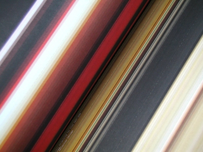
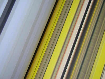
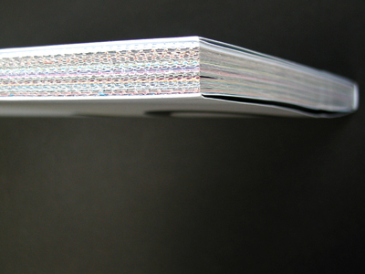
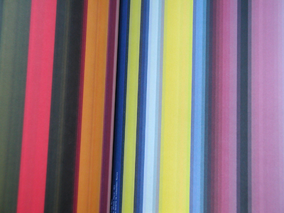
I'm sorry to be so Dutch-centric, but some amazing things are coming from the Netherlands these days. "Grafisch Nederland 2005 - Kleur/Colour," designed by Irma Boom, is a monumental achievement in the art of bookmaking. It's probably one of the most remarkable pieces of printed matter I've seen.
Grafisch Nederland is an annual yearbook published by the Dutch Association of the Graphic Industry. Each year, a team (designers, printers, binders, etc.) is created to produce a book based on a given theme. The stars were definitely aligned for 2005.
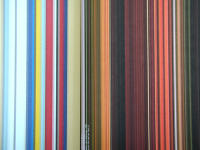
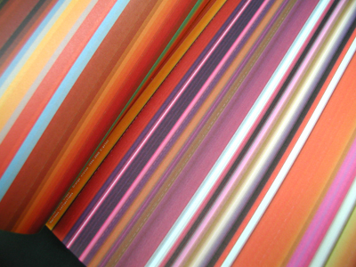
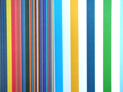
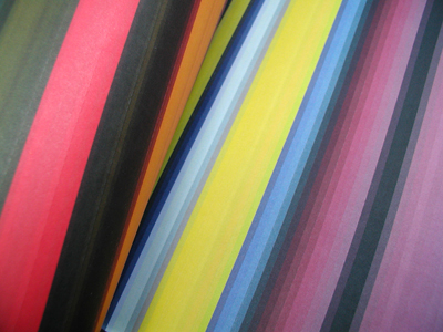
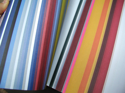
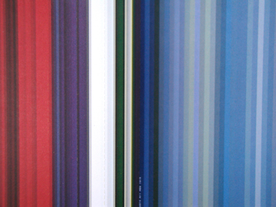
Most of this publication's allure can be attributed to its color. A majority of other printed pieces (i.e. posters, magazines) have colors derived from a combination of four inks: cyan, magenta, yellow, and black (CMYK). This book contains over 80 Pantone (premixed) inks with hues and shades that are impossible to achieve through CMYK. Point is: the colors are vivid, lush, occasionally surprising and always stunning.
The contents of the book consist of abstract line diagrams based on the palettes of famous contemporary and classic paintings (I was only able to guess three!). The pages are uncut and perforated, therefore the reader must cut open every other page to reveal the spread.
"Colour is one of the most frequently discussed subjects in art, sciences and everyday life. Thousands of books have been written about it. There are even whole libraries—the Faber Birren collection (Yale University, USA), for example—that are devoted entirely to colour. Colour is a phenomenon that is almost impossible to grasp, and yet everyone has something to say about it. ...For psychologists and philosophers, artists, physicists and chemists, colour is a subject of study. For the designer, architect and painter, and for the printer too, it is a tool."
-Excerpt from Grafisch Nederland 2005
More info: http://www.grafischnederland.nl/