![]()

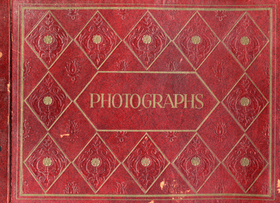
Excerpts from a found scrapbook, circa. 1960.

I'm sorry to be so Dutch-centric, but some amazing things are coming from the Netherlands these days. "Grafisch Nederland 2005 - Kleur/Colour," designed by Irma Boom, is a monumental achievement in the art of bookmaking. It's probably one of the most remarkable pieces of printed matter I've seen.


After having read this article in the NY Times, I chuckled at the thought of someone devouring a Metrocard-styled cookie. Why make something so beautiful (a cookie) resemble something so terribly inferior (the Metrocard design)? I felt inclined to pull out some of my favorite Dutch PTT Telecom phone cards that would, in my opinion, inspire some delectable treats. Chow down.

Image taken from The University of Texas at Austin 1955 Yearbook. Alpha Chi Omega sorority.

My in-laws recently purchased a new home and along with it came quite an unusual specimen. This grafted tree is one-part oak and one-part pecan, joined just below the branches.